YOFonts License Agreement v1.00
This license can also be found at this permalink: https://www.fontsquirrel.com/license/Grov-Condensed-AB
NOTES about YOFonts FREE
Please read this before you install YOFonts FREE.
1. There are two kinds of folder; "outline font" and "read me html".
2. The Japanese Kana fonts are in 1-byte code format.
3. DO NOT modify these files.
4. DO NOT publish these files without permission. (example: CD-ROM font library, etc)
5. DO NOT put these files on your web page as a link.
6. Attach this "read me html" folder with font file when you give these to someone.
7. You are welcomed to link from your site to YOWorks (http://www.yoworks.com/).
Thank you. Enjoy YOFonts FREE.
Yamaoka Yasuhiro @ YOWorks (June/2006)
YOFonts FREE are FREEWARE.
E-mail: mail@yoworks.com | YOWorks Web Site: http://www.yoworks.com/
Fonts

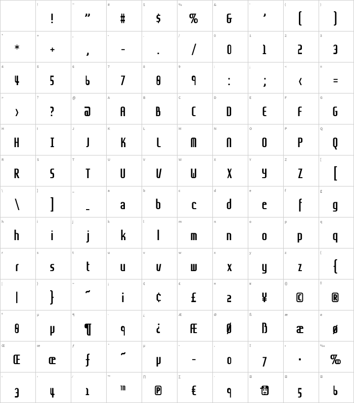
Grov Condensed AB Regular | 134 Glyphs |
|

Grov Condensed AB Bold | 134 Glyphs |
Font Information
Grov was called Yamaocan Chicago, the font for my music work: Yamaocan Groove in 1996. The inspiration for this font, as the original name shows, came from Chicago: the system font for MacOS. Elementa, the other my personal interpritation of Chicago, seemed not fit to my image for Yamaocan Groove. So, I designed new personal version of it. Later, I decided to put this font as freeware, then changed the name to Grov. Since shown on my web page, Grov was the most requested font. I also have received the requests to expand the Grov family. Now, Grov family is increasing slowly.
Japanese Kana complements originally began as my personal complements for Chigago in 1998. As soon as I began to draw them, I found it was better to design them for my Grov. I also had received a few e-mails which are asking Kana complements for Grov. I decided to design my new Kana fonts with the elements from Grov as possible.
In 1999, the condensed complement for Grov is designed out from my need. Sometimes I used Grov in condensed letterform by scaling effect. But, this always caused the problem that Grov’s letterform distorted in a too weak weight. So, I decided to add new condensed family to Grov.
The bold complements for Grov family is designed in 2000-2002. Actually, bold complements for the upright characters had done in 2000. But, I could not finish the italic complements for various reasons, and I wanted to show them together. In October-Novemver/2002, they are completed.
Grov is designed by Yamaoka Yasuhiro 1996-2002.
| Downloads: | 31,304 | |
| Uploaded on: | September 23, 2009 | |
| Designed by: | YOFonts | |
| Classification: | Display | |
| Tags: | Condensed, Headline, Poster, Square | |
| Languages: | Show Language Support | |
| Some Fonts Also Support: |
Font Squirrel relies on advertising in order to keep
bringing you great new free fonts and to keep making improvements to the web font generator.
If you are seeing this message, you probably have an ad blocker turned on. Please consider
disabling it to see content from our partners.
Alternatively, you can support Font
Squirrel by purchasing a paid license from our sister site,
Fontspring.


